
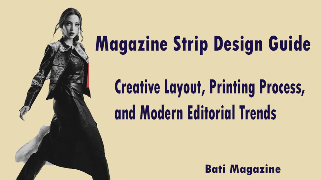
Magazine Strip Design Guide: Creative Layout, Printing Process,and Modern Editorial Trends
Introduction: Why Magazine Strip Design Still Matters in a Screen-Saturated World
Over 7,000 magazine titles are still actively published in the United States alone, and print readership has shown a surprising resilience over the past five years. That number tells you something important. People still pick up magazines. They still flip through pages, and they notice design instantly, often before they read a single word.
Magazine strip design is one of the most specific and technical areas inside editorial layout work. A strip, in print design, refers to a narrow horizontal or vertical band of content that runs across a page or spread. It can carry images, text, color blocks, or all three at once. When done right, a strip pulls the reader’s eye across the page and creates a natural reading path that feels effortless.
This guide breaks down everything you need to know about magazine strip design. You will learn how to plan creative layouts, what the printing process actually looks like, and which modern editorial trends are shaping the way designers work today. Whether you are a student, a working designer, or a magazine editor, this article gives you real, useful information.
What Is a Magazine Strip and Why Does It Matter?
A magazine strip is a design element that stretches across a portion of a page in a long, narrow shape. Think of it like a ribbon of content. It can be purely decorative, or it can carry important information like a pull quote, a photo series, a color band, or a headline.
Strips create visual rhythm. They break up large blocks of text and give the reader’s eye a place to rest or a direction to follow. A well-placed strip can make the difference between a page that looks busy and one that looks intentional. This is why editorial designers spend serious time planning where strips go and what they contain.
Strips also serve a structural purpose. In multi-column layouts, a strip can act as a connector between different content areas. It signals to the reader that two sections are related, or it can separate stories so readers do not accidentally blend them together. The function depends on the design choice, but the impact is always significant.
The Foundation: Grid Systems That Make Strip Design Work
Every strong magazine layout starts with a grid. A grid is an invisible structure of rows and columns that tells you where to place content on the page. Without it, pages look accidental. With it, even complex layouts feel organized and easy to read.
For strip design specifically, the grid determines how wide or tall a strip can be. Most editorial grids use a 12-column structure because it divides evenly into halves, thirds, and quarters. A strip might span all 12 columns across the page, or it might sit within a 6-column zone on just one side. The grid gives you rules, and good designers know when to follow them and when to break them on purpose.
Baseline grids are equally important. These are horizontal guides that keep your text sitting on consistent lines from column to column. When a strip interrupts the body text, the baseline grid helps you pick up where you left off without the layout looking broken. Mastering both types of grids takes practice, but it is the single biggest skill boost for any editorial designer.
Planning Your Magazine Strip Layout: Where to Start
Before you open any design software, you need a content map. A content map is a simple sketch or written list of what goes on each page. Knowing your content first means your design choices will serve the story instead of fighting it.
Start by identifying the dominant element on each page. Is it a large photograph? A bold headline? A data visualization? Whatever that dominant element is, your strip design should support it, not compete with it. A strip that grabs more attention than the main image will confuse the reader and weaken the page.
Next, decide on the purpose of your strip. Ask yourself three questions. Does this strip guide the eye? Does it carry supplementary information? Does it add visual texture to balance the page? Once you answer those questions, the shape, size, and content of the strip become much clearer.
Thumbnail sketching is still one of the best tools available. Draw small, rough versions of your page layouts by hand. You do not need artistic skill for this. You just need to block out zones for text, images, and strips. Spending 10 minutes with a pencil can save hours of digital rework.
Color Theory in Magazine Strip Design
Color is one of the most powerful tools in strip design, and it is also one of the easiest to get wrong. A strip filled with a strong color immediately draws the eye. This can be a huge benefit or a serious problem depending on where that strip lives on the page.
Use color in strips to reinforce your publication’s brand identity. If your magazine uses a signature palette, carry those colors into your strips consistently. Readers begin to associate certain colors with certain sections, which helps them orient themselves in the magazine. This kind of color coding is common in news and lifestyle magazines because it speeds up navigation.
Contrast matters more in print than it does on screen. What looks vibrant on your monitor can appear dull or too dark on paper. Always check your color values in CMYK mode when designing for print. RGB colors are for screens only, and printing a magazine in RGB will give you unexpected and often disappointing results.
A neutral strip can be just as powerful as a colorful one. White space is not empty space. It is breathing room. A light gray or off-white strip against dense body text gives the eye a place to pause, and that pause actually makes readers more likely to engage with the content surrounding it.
Typography Inside Strips: Making Text Work in Tight Spaces
Strips are narrow by nature. That means any text placed inside one has to be carefully chosen and sized. Large headlines rarely work inside thin horizontal strips. Short, punchy phrases or single numbers work much better.
Pull quotes are a classic use case for magazine strips. A pull quote is a short excerpt from the article, usually 10 to 20 words, pulled out and styled in a larger or bolder typeface. When placed inside a strip, it breaks the reading experience in a good way. It gives the reader a reason to pause and preview the content.
Type hierarchy is critical inside strips. Even in a small space, you need the reader to know what to read first. Use size, weight, or color to signal importance. The most important text gets the biggest or boldest treatment. Supporting text, like a photo credit or a section label, gets smaller and lighter treatment.
Avoid placing long paragraphs of body copy inside strips. Nobody reads them. Strips are meant for quick consumption. If you find yourself writing three sentences inside a strip, you probably need to reconsider what that strip is actually doing on the page.
Photography and Imagery in Magazine Strip Design
Images inside strips require a different mindset than images placed in open page areas. A strip is a constrained space, which means the crop of the image becomes extremely important. Poor cropping in a strip can make faces look cut off, or it can strip away the most interesting part of a photo.
When selecting photos for strips, look for images with strong horizontal or vertical lines that work with the strip shape. Abstract textures, close-up details, and landscape shots often translate well. Full-body portraits or wide-angle group shots rarely work because the strip crops out too much information.
Contact sheets and outtakes from photo shoots are often goldmines for strip imagery. The main editorial photo gets used in the main layout. But the surrounding frames, the hands, the background details, the secondary moments, are often perfect for strip placement. These details enrich the visual storytelling without overwhelming the page.
Bleed is a crucial printing concept when images extend to the edge of a strip. Bleed means the image extends slightly beyond the trim line of the page so that when the paper is cut, there is no white edge visible. For most print jobs, you need at least 3mm of bleed on every side where an image runs to the edge.
The Printing Process for Magazine Layouts
Designing a beautiful magazine is only half the job. Understanding how it gets printed is what separates professional designers from beginners. The printing process affects every design decision you make, from color to paper stock to file setup.
Most commercial magazines are printed using offset lithography. This process involves transferring ink from a plate to a rubber blanket and then onto paper. It produces very consistent, high-quality results across large print runs. Offset printing is cost-effective for thousands of copies, which is why major publications use it almost exclusively.
Digital printing is increasingly popular for short-run and specialty publications. If you are printing a boutique magazine, a niche publication, or a limited edition issue, digital printing gives you flexibility without requiring expensive plate setup. The quality has improved dramatically in recent years, and modern digital presses can match offset quality for most editorial purposes.
Paper selection has a massive impact on how your strip design reads in print. Coated papers, like gloss and silk, make colors pop and photos look sharp. Uncoated papers give a more natural, organic feel and work beautifully for literary or arts-focused publications. The weight of the paper also matters. Cover stock is heavier than interior pages, and some premium magazines use heavier stock throughout to convey quality.
| Paper Type | Best For | Finish Quality |
|---|---|---|
| Gloss Coated | Fashion, lifestyle, photo-heavy layouts | High contrast, vibrant colors |
| Silk/Matte Coated | Editorial, mixed media, text-heavy pages | Soft finish, reduced glare |
| Uncoated | Literary, arts, independent publications | Natural feel, easy to write on |
File preparation is where many designers make costly mistakes. Always set up your document at the correct trim size with bleed and margin guides already in place. Export your final files as PDF/X-1a or PDF/X-4, depending on your printer’s specifications. These PDF formats embed all fonts and color profiles, which prevents font substitution and color shift errors.
Modern Editorial Trends Shaping Magazine Strip Design
Editorial design does not stand still. The best designers pay attention to what leading publications are doing and figure out why those choices are working. Several clear trends are defining how strips and layouts are being used in contemporary magazines.
Maximalist color blocking is one of the most visible trends right now. Instead of subtle tints or neutral strips, designers are using full-saturation color bands that span the entire width of a spread. These bold strips often carry white text and create an almost poster-like quality on the page. Publications like Apartamento, Dazed, and i-D have pushed this approach into the mainstream of editorial consciousness.
Mixed media integration is becoming more common as digital and print blur together. QR codes placed inside strips link readers to video content, audio interviews, or interactive features online. The strip becomes a bridge between the physical page and the digital experience, giving print a layer of interactivity it never had before.
Handwritten and irregular typography inside strips is appearing more often as a reaction to overly polished digital aesthetics. Designers are scanning handwritten text, distorting type, and using irregular baselines inside strip elements to create a raw, human quality. This approach works especially well in independent and arts-focused publications where personality and voice are central to the brand.
Data visualization strips are a growing trend in news magazines and long-form journalism titles. Instead of pulling out a quote, the strip carries a chart, a statistic, or an infographic. These visual data moments give readers a quick fact to absorb before they commit to reading the full article. It respects the reader’s time while still communicating important information.
Sustainability is influencing design choices too. More magazines are working with printers who use vegetable-based inks and recycled paper stocks. Designers are being asked to limit the use of heavy ink coverage in strip areas because dense ink coverage increases drying time and can affect print quality on recycled substrates. Designing with sustainability in mind is becoming a professional expectation, not just a bonus.
Common Mistakes in Magazine Strip Design and How to Fix Them
Even experienced designers fall into patterns that weaken their layouts. Knowing the most common strip design mistakes helps you catch them before they go to press.
Overloading the strip with content is the most frequent error. A strip tries to be a headline, a photo, a pull quote, and a color block all at once, and the result is visual noise. Pick one job for each strip and commit to it. Less content in a strip almost always means more impact.
Ignoring visual flow is another big issue. Strips should guide the reader’s eye through the page in a logical order. If your strip placement interrupts the natural reading path without a good reason, readers will feel confused even if they cannot explain why. Always trace your eye path through a layout before you finalize it.
Inconsistent strip sizing across a spread or across multiple pages makes a magazine feel disorganized. Readers notice patterns, even subconsciously. When strip sizes vary randomly from page to page, the publication loses its visual identity. Establish a set of strip proportions in your style guide and stick with them throughout the issue.
Forgetting to account for printing tolerances is a technical mistake with real consequences. Printers cut pages with a tolerance of about 1 to 2mm in either direction. If you place important text or a thin strip very close to the trim edge, it might get cut off in the final print run. Keep all critical design elements at least 5mm inside the trim line.
Building a Magazine Strip Style Guide
A style guide is a document that captures all of your design rules in one place. For magazine strip design, this document is essential for keeping a consistent look across multiple issues and across multiple designers working on the same publication.
Your style guide should include the exact dimensions for each strip type you use. Document the standard widths, the color values in CMYK, the typefaces and sizes, and the spacing rules. Include examples of correct usage and also examples of what not to do. Clear visual examples make style guides far more effective than text descriptions alone.
Update your style guide at least once a year or after every major redesign. Magazines evolve, and your design rules need to evolve with them. A style guide that sits unchanged for five years stops being useful and starts being a limitation.
How to Present Magazine Strip Designs to Clients and Editors
Designing great strips is one skill. Getting your designs approved is another. Editors and clients often have strong opinions about layout, and they do not always speak the same language as designers.
When presenting your strip design choices, always lead with the function. Explain what the strip does for the reader before you talk about how it looks. Say something like, “This color strip helps readers identify the fashion section immediately,” rather than, “I thought this pink strip looked good here.” Function-based explanations land better in editorial meetings because they connect design to editorial goals.
Show your designs in context. A strip design pulled out of the page and shown in isolation never looks as strong as it does in the full layout. Always present your strips within the complete page or spread so the decision maker can see how everything works together.
Be ready to explain your printing choices. Editors may not know the difference between gloss and silk coated paper, or why bleed matters, but they will ask questions when costs come up. Prepare a short explanation of why your chosen paper and print specifications serve the magazine’s goals.
Digital Tools for Designing Magazine Strips
The right software makes the process faster and gives you more precise control over your layouts. Adobe InDesign is the industry standard for editorial layout work and handles all aspects of magazine strip design well. It supports master pages, grids, color management, and PDF export at professional print specifications.
Adobe Illustrator is useful for creating complex strip graphics, icons, and custom typographic elements that you then place into InDesign. Many designers build their strip components in Illustrator and import them as linked files, which keeps the InDesign document manageable.
Affinity Publisher is a strong alternative for designers who want professional capability at a lower cost. It handles multi-page documents, color profiles, and print export settings competently. For independent magazines on a tight budget, it is a serious option worth considering.
Figma is increasingly used in editorial contexts for collaborative layout work, especially when multiple people need to access and edit the same document. However, its print output capabilities are still not as robust as InDesign, so most Figma-based magazine work is eventually finished in InDesign for the final print files.
Real Examples of Effective Magazine Strip Design
Looking at real publications is one of the fastest ways to train your eye for effective strip use. Vogue consistently uses thin horizontal color strips to separate editorial credits from main feature photography. The strips are subtle but create a clear visual boundary that serves the reader without distracting from the images.
National Geographic uses wide horizontal strips of color to introduce new articles. These strips often span the full width of the page and carry the section name, the issue number, and a brief teaser. They function like a chapter header in a book and help readers orient themselves in a very content-dense publication.
The New York Times Magazine uses strips differently, often placing them vertically on the inner margin of a spread to signal related content across pages. This is a sophisticated use of the strip format because it requires the reader to hold two pages in view simultaneously, which creates a more immersive reading experience.
Independent publications like Kinfolk have built their entire aesthetic around restrained, minimal strip usage. Thin lines, subtle tonal bands, and careful use of white space create strips that feel almost invisible but still do structural work on the page. This approach suits the magazine’s calm, considered editorial voice perfectly.
Conclusion: Good Strip Design Comes From Intentional Choices
Magazine strip design is not about decoration. It is about directing attention, organizing information, and creating a reading experience that feels natural and rewarding. Every strip you place on a page should have a clear reason for being there, a clear function it serves, and a clear relationship to the content around it.
The printing process matters just as much as the visual design. Understanding how offset and digital printing work, how paper stock affects color and texture, and how to set up your files correctly will protect your creative work and ensure it reaches readers the way you intended.
Modern editorial trends will keep shifting, and that is a good thing. It means there is always something new to learn, always a fresh approach to consider, and always room to do something that has not been done before. The designers who stay curious and keep looking at strong publications will always find new ways to make strips work harder on the page.
If you are starting a new magazine project, grab a pencil and sketch your first layouts by hand today. Plan your grid before you open your software. Choose your strips based on function first and aesthetics second. Talk to your printer early so there are no surprises at press time. And always, always look at your layout through the reader’s eyes before you call it done.


Responses